
3-4
mins
Say who you help, prove you can do it, then tell them what to do next. In that order. A number or a named result beats a photo of a skyline you don’t live in. Carry your company’s colors and logo too, because as a tech founder, you are the company.
Why does the banner matter more than most tech founders think?
Because your buyer does most of the deciding without you there.
6sense surveyed just under 4,000 B2B buyers for its 2025 Buyer Experience Report, and 94% said they’d put their shortlist in order of preference before speaking to a single seller. The vendor sitting at the top of that ranking when the first conversation happens wins 77% of the time. Technology companies were 42% of that sample. That’s your buyer.
That ranking gets built during what 6sense calls the Selection Phase, the first roughly 60% of the journey, all of it independent research.
Research means pulling up your profile and having an honest chat with yourself. Am I patting myself on the back too much? No exaggeration, there’s a 99% chance you probably are. If you’re in the 1%, you might be saying too little.
You’ve got about 1.8 seconds before someone decides whether to keep reading. Same goes for YouTube, TikTok, and Instagram videos. That number doesn’t move because your product features are amazing. It applies to your headline, your banner, and the first line (hook) of every post you write.
Your banner is the largest single thing on the page during those 1.8 seconds. Most tech founders hand that space to a stock photo of a city they don’t live in, sadly.
I ghostwrote for 131-plus Fortune 500 executives before I ever built a profile for a tech founder. The banner was the most wasted piece of real estate on nearly every one of them, and it’s worse among founders, who are usually building the thing themselves at 11pm between builds and sales calls.
Your banner is selling while you’re absent, in their own office or house.
What actually goes on a tech founder’s banner, and in what order?
4 elements at most, each saying something the last one didn’t.
The mistake I see constantly is a banner that repeats the headline. That, or how many exits you’ve had. (No one cares, literally). Your headline already said who you help. Say it again up top and you’ve spent the biggest asset on the page adding nothing.
Think of the profile as a top-to-bottom handoff. Banner, headline, About section, each one passing the reader down with something new in their hands.
The order that works:
-The pain point (and the emotion tied to it) first, so the reader knows in a second whether this is about them.
-1 credibility element next: A metric, a named result, or a piece of social proof
-Any “featured in” or partner logo kept small and placed in the top right corner
-The call to action last, at the bottom, once they understand who you are and why it matters
That CTA placement is where instinct fights hardest. The instinct makes sense. You’ve got a limited surface and you want the ask on it. This can be as simple as DM me.
-The logo rule is the one tech founders argue with me about most. Everybody wants their mark big and centered like a championship banner in the rafters. That’s ego, and it costs you the only spot on the page where the eye reliably lands.
Top left, super small. Your logo doesn’t carry you. It doesn’t work for execs at places like Nvidia, Intel, Microsoft, and it damn sure won’t carry you as a founder.
LinkedIn™ makes the same point from a different angle in its own help documentation, noting that photos render better than images containing logos on a profile background. Small. Corner. Done.
2 more mechanics worth having.
Don’t reuse your profile photo as your banner image. The banner is a second surface, and it should carry something the photo hasn’t already said. Sounds cheesy, but the real estate agent tilt-look works best. I recommend the AI portrait generator BetterPic. None of the weird AI smoothness, distortion, or giveaways like with Nano Banana or other programs.
10% off with promo code STEVE or this link. Trust me, you’ll love it.
Also, don’t leave it empty. A blank banner is (almost) worse than a mediocre one, and a template you edited in 4 minutes in Canva clears the bar comfortably. If you’re mid-rebrand and hate every option, put up something plain and fix it in a month, or hire us to do it.
A caveat that lands hard at Series A: If your market’s early enough that you genuinely don’t have a defensible metric yet, don’t invent one to fill the slot. A fabricated number reads as salesy to exactly the buyer you’re chasing, which means the banner starts costing you credibility instead of building it.
Pull the number out and lean harder on a clear statement of who you help and how.
If you’re on Premium, you can load up to 4 banner images and run a sequence across them. A result on one, a testimonial on the next, the CTA on the last. Most people paying for Premium never find the feature.
Should a tech founder’s banner match their company’s brand?
Yes, of course. Logo, colors, on purpose. Consistent branding creates less confusion when they’re really digging into you, which they will. Hey, there’s big money on the line here, right?
This is the one place where the advice for tech founders runs directly opposite to the advice for executives, so it’s worth being blunt about which one you’re reading.
An executive inside somebody else’s company usually should build visual branding independent of their employer, because the employer can change and their visibility has to survive it. That’s correct advice for them. The banner your comms people handed you isn’t doing you any good.
If you’re selling to clients for your brand, that’s different. Even then, you’re in charge of your own banner message. Clear it with them first, but don’t be lazy here and just assume what they gave you is best. I led global corporate tech social programs.
Trust me, your social team has little concept of the right things to display and they’re probably caving to PR or comms.
You’re the company. Instant recognition between your face and your product is the entire point, and separating them throws away something you can’t buy back.
When a buyer sees your post in the feed on Tuesday and hears your company mentioned 3 weeks later, those 2 things should snap together without any effort on their part.
That fusion has value past marketing, too. It matters to anyone who eventually buys the company, and a tech founder who spent years keeping their LinkedIn identity walled off from the brand has less to sell.
On the actual colors: Sample from a brand that already owns a strong visual identity. There’s a reason Intel and LinkedIn both land on blue and white. Blue reads as trust and reliability, which is why so much of tech converges there. Gold reads as prestige, which is why TORC runs black and gold.
Choose the colorway for the job it has to do. Liking the shade isn’t a reason. 2 different shades of blue and adding white is always safest. (See Intel’s colors).
This is also the moment to check whether your profile is doing 1 job or 2. A profile split between recruiting engineers and selling to buyers dilutes both, and the banner is usually where that split first becomes visible. Pick. Don’t negotiate with yourself. Fortune favors the bold.
If you’re wondering whether any of this earns an afternoon, look at who else is reading it. Investors run the same private research your buyers do, which is why a founder’s LinkedIn is already functioning as due diligence before a first meeting ever gets booked.
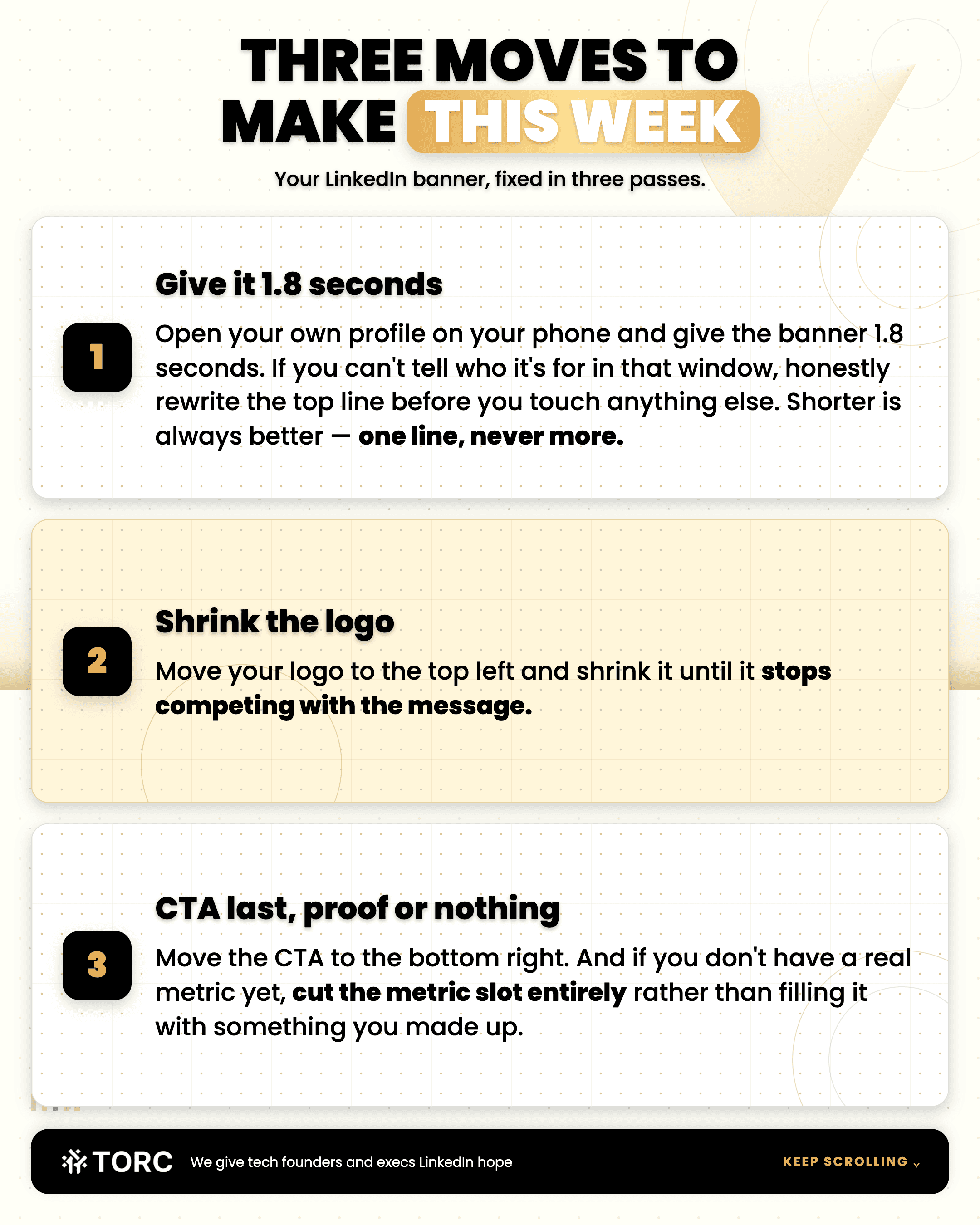
3 moves to make this week
Open your own profile on your phone and give the banner 1.8 seconds. If you can’t tell who it’s for in that window honestly, rewrite the top line before you touch anything else. Shorter is always better. 1 line, never more.
Move your logo to the top left and shrink it until it stops competing with the message
Move the CTA to the bottom right, and if you don’t have a real metric yet, cut the metric slot entirely. Never fill it with something you made up.
That last one separates a banner that converts from one that reads as marketing. Buyers at this level can smell an invented number from the feed.
A dialed-in profile is also what makes outreach work at all. The tech founder behind our fintech case study started 77 conversations and booked 12 sales calls in a single month, and none of that sequence converts if the profile people land on has nothing to say.
Fix the banner first. It takes an afternoon and it works on every visitor from then on.
Steve Lewis
CEO
TORC Executive Marketing
Want the human version of executive and founder personal branding and lead generation?
FREQUENTLY ASKED QUESTIONS
What size should a tech founder’s LinkedIn banner be?|
Design at the full dimensions LinkedIn recommends for a profile background photo, and keep your most important text clear of the bottom-left corner where the profile photo sits on top of it. Check it on mobile before you call it done, because the crop is tighter than desktop. LinkedIn also notes that a blurry background photo usually means the source file was too small.
Should a tech founder put their company logo on their LinkedIn banner?
Yes, kept small and in a corner. A tech founder is the company, so the visual link between them is an asset worth building deliberately. The eye should land on your message or your buyer’s pain first, and a large centered logo takes that spot.
What if I don’t have a metric strong enough to put on my banner?
Leave it out. Inventing a number to fill the slot reads as salesy to the exact buyer you’re targeting, and an early market often genuinely has no benchmark yet. Use a clear statement of who you help and how, then add the number once you’ve earned one.
Is banner advice for tech founders the same as for executives?
No, and this is one of the places the 2 reverse. An executive inside somebody else’s company usually benefits from visual branding independent of their employer, because employers change. A tech founder carries the company’s colors and logo, because the founder and the company are the same asset.
Can I use my LinkedIn profile photo as my banner image?
Avoid it. The banner is a second surface and should add something the photo hasn’t already said. Running 1 image across both wastes the only piece of profile real estate large enough to carry a real claim.
TORC GPT
Still have a LinkedIn™ question? Ask the TORC GPT.
Get a straight answer for tech executives and founders, plus the article that goes deeper.
Popular questions

Tech Executive & Founder Positioning
How to add a featured section on LinkedIn as a tech executive
The 5 steps to a LinkedIn featured section that books calls: A gated lead magnet in slot 1, a gated Contact Me form in slot 2. Built for tech executives.
Tech Executive & Founder Positioning
How to add a featured section on LinkedIn as a tech executive

Content Strategy & Ghostwriting
How do you find the best LinkedIn ghostwriter for a tech CEO?
How tech CEOs and executives pick the best LinkedIn ghostwriter: 3 first-call questions, why to skip the sample post, and how long a fair trial runs.